Global Mailers 24-25
Global Mailers 24-25
#5: ‘Motif Mayhem’
January, 2025
Istanbul, Türkiye
I can still see tulips blooming from the blood of his eyes.
Perhaps the tulip knew the inconstancy of the world,
That it never let the cup of wine leave its palm from birth till death.
- (Poems from the Divan of Hafiz) SHEMSUDDIN MAHOMMAD
to die by design, well the pleasure, the privilege is mine
Hand-cut stencils, watercolor, sponge | 10x14.8cm
Tiles tiles tiles! This month I got desperately hooked on motif and design. I am learning that my eye instinctively tries to recognize pattern and make meaning, which seems to be the developing thesis of this project: the artistic themes that frequent a place. Where do they come from? Why were they chosen, and chosen again? What could they mean, and how has that meaning changed over time?
Well, if Brazil and Paris chummed the waters to the potential hook of patterns, Türkiye caught me square through the gills. There is much to be said, read and learned from the history of design in Istanbul, and even more about the materials that make up these designs. From the beginning, two things caught my eye: 1) the prevalence of tiles and 2) the repeating motifs across the city.
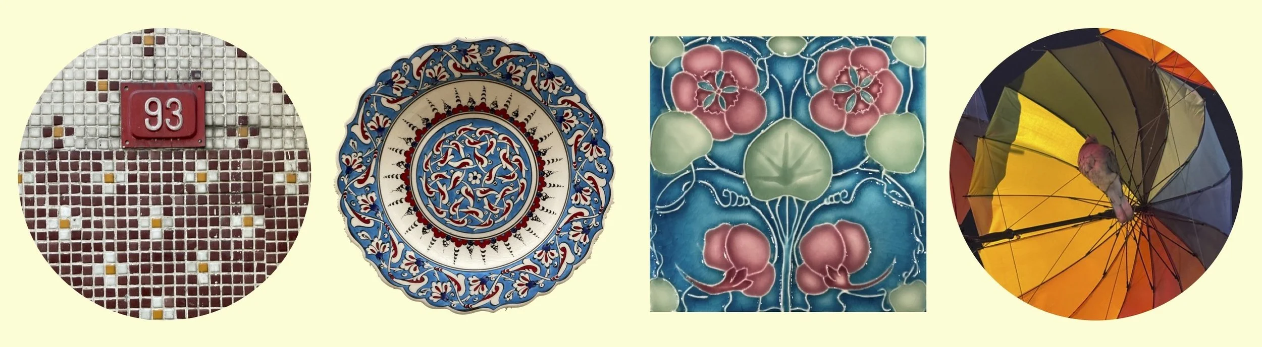
Tiles are one of the most ubiquitous architectural building blocks: they are made from an organic and widely-available material, they are hygienic and easy to clean, they are both waterproofing and fire resistant, and they can support a variety of designs and adornments. The two main clay-based tile families are glazed and unglazed, each containing (approx) four and three sub-groups, respectively. Unglazed - quarry, encaustic, mosaic. Glazed - faience/tin-glazed, lustre, cuerda seca, underglaze painting.
For your listening pleasure.
If you can imagine the variety of tile productions, now begin to think about the specific styles and motifs characteristic to each period, region, class, etc. When we talk about the tiles of Istanbul, we inevitably reference Middle Eastern and Ottoman styles, which are largely characterized by their geometric symmetry and botanics. Specifically, these tiles are called Iznik, named after the town they were manufactured in, just outside of Istanbul.
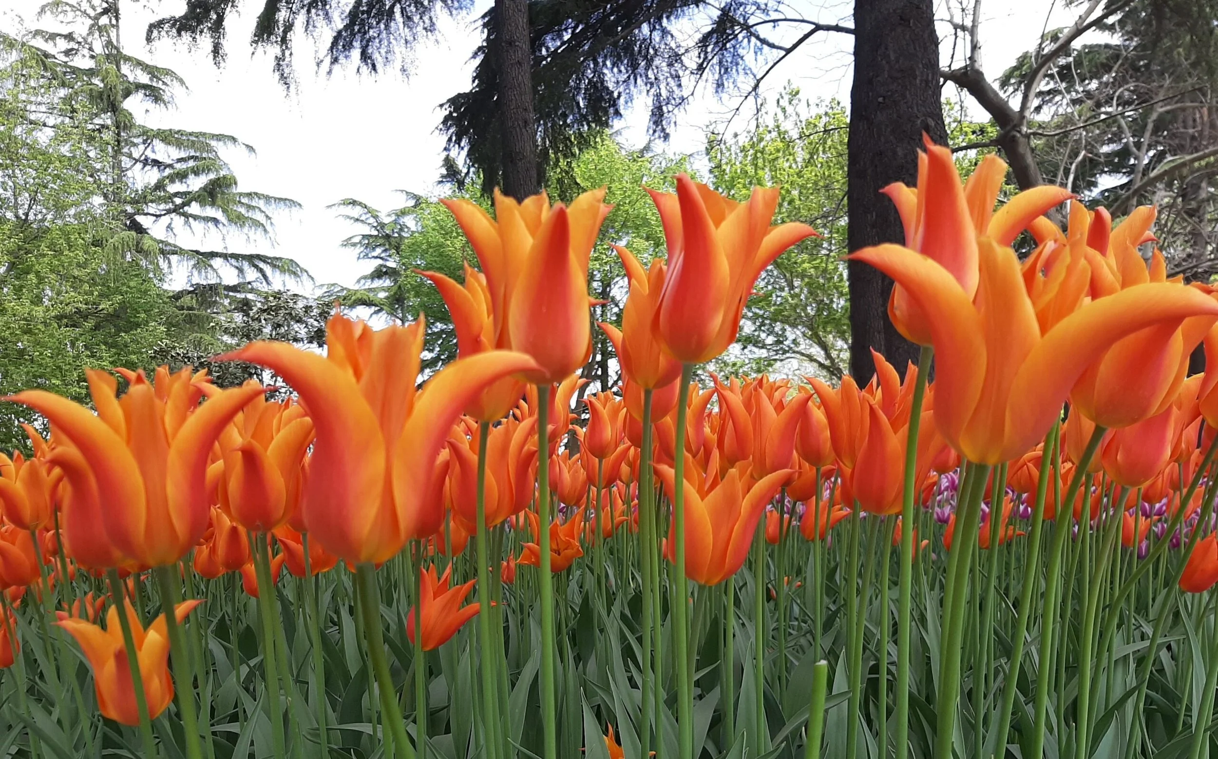
So why are certain patterns picked, and why do specific motifs keep showing up? In the case of Iznik tiles, the geometry is meant to represent infinite nature of Allah and the unity of creation, and the florals symbolize paradise and the divine beauty of nature. Specifically, one flower always seems to sprout up: the tulip.
Originally cultivated in Central Asia and Iran, tulips became the revered bloom of the Ottoman Empire. The tulip translated a symbol of power and strength. This intense love of tulips is also credited to enticing the eye of European travelers, who eventually brought the bulb to its most world-renowned home, The Netherlands. In the Türkiye of today, the Tulip symbolizes abundance, prosperity, and renewal, reflecting the cultural richness and artistic expression embraced during the Ottoman Empire.
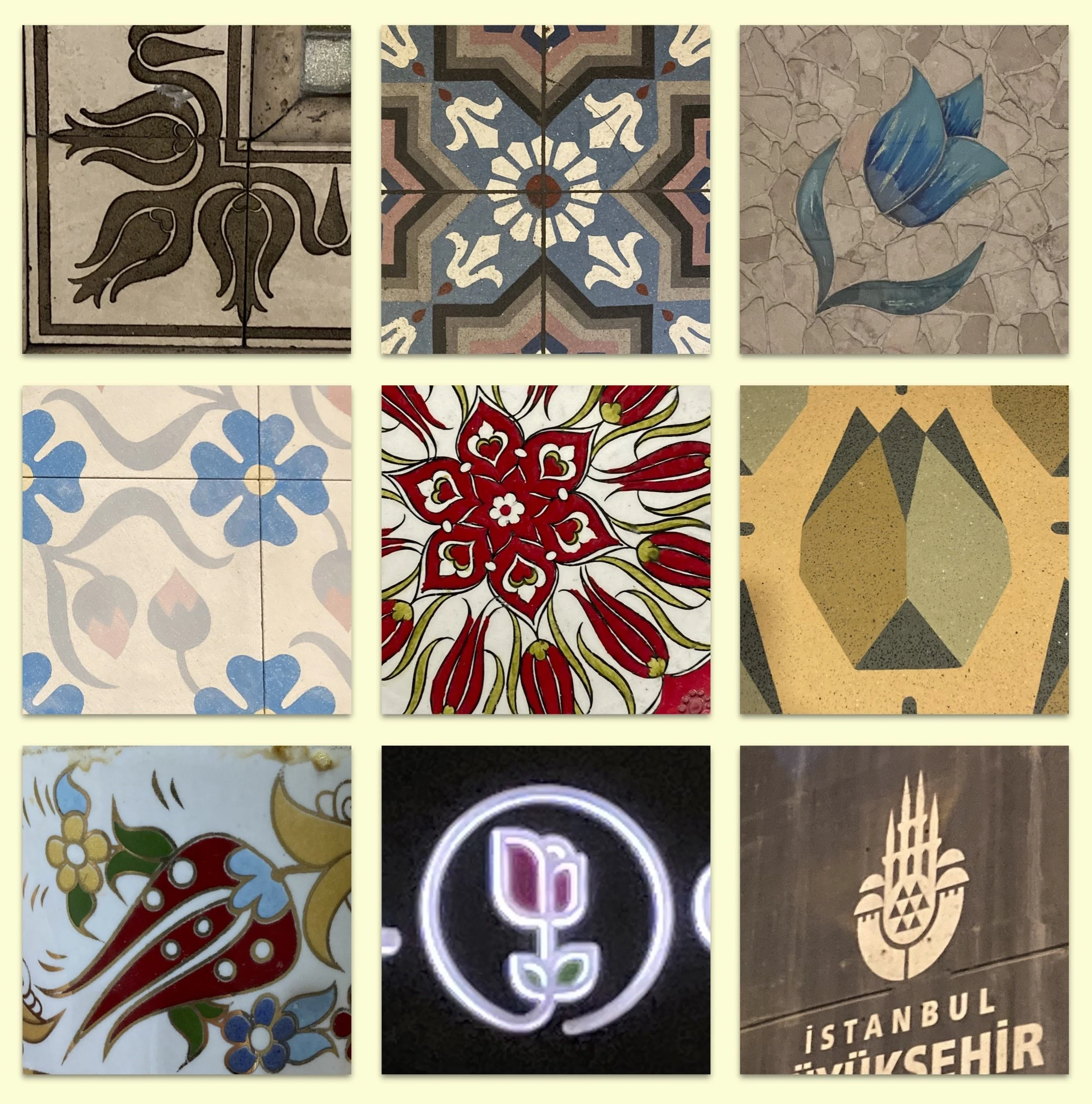
As you can imagine, I spent my weeks in Istanbul with my eyes taped open. I was looking for patterns everywhere; in tiles, metro stations, door handles, window grates, faint impressions in concrete. I tried to catalog as many as I could, and I also tasked my students with documenting and researching the reappearing patterns that captured them.
As a group, we visited an artisan Turkish company that specializes in revitalizing encaustic cement tiles [Karoistanbul, and I recommend them with my whole chest]. I loved their designs so much that I carried around a 3x3in cement tile with me across six countries until I laid it to rest in a beautiful park in Nepal (due to luggage weight constraints).
…Which leads me to the postal product for Türkiye: tiles! I wanted to coalesce my love for pattern, the important icons I came across in my travels, and moments that felt integral to my experience. I also used this opportunity to test my hand at designing and executing a four-color print with MacGyvered materials.
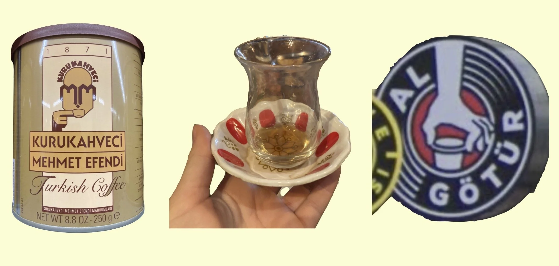
It began with isolating the images and ideas I loved: Turkish coffee and çay (important to every meal and deliciously ceremonious), the best coffee logos I have ever seen (Kurukahveci and Al Götür), the classic çay glass + plate set (and their uncanny resemblance to - let me hear you say it - tulips!)
I came up with initial sketches and iterations that balanced central images and background design elements**
I isolated the final images into layers based on a four-color minimum
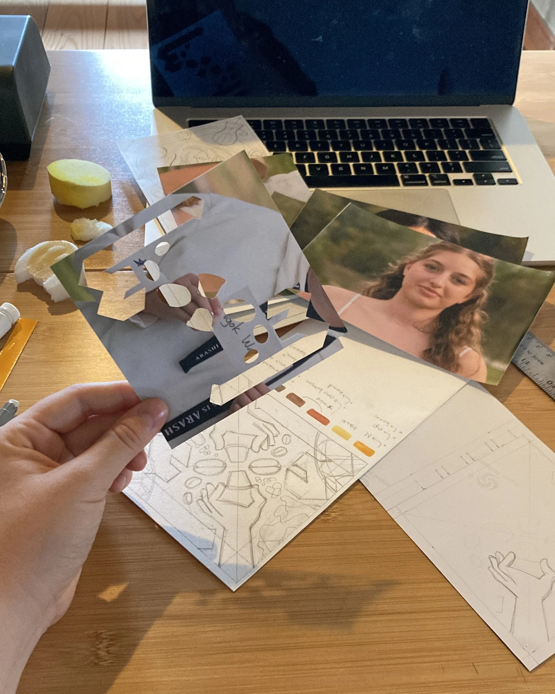
I hand-cut stencils for each layer from photo paper (which proved best for flexibility and water resistance) (I want to express my gratitude to those students who unknowingly volunteered their headshots for this task)
Finally, I applied the color of each layer using an old sponge from a shoe-polishing kit I took from a hotel.
The ‘in-the-field’ experimentation and problem solving of this project was so fun and reminded me why I love printmaking so much. (Shoutout Umbau and all the landers around the world and in the sky. OLGA!)
Teşekkürler and enjoy!
** I was able to complete an incredible class with my students on repeating pattern design and methods. I encourage you all to try it as an activity yourself. It is such a curious, exploratory project and one that yields really beautiful products you can use for so many things. I will attach my lesson plan here!
A moment for the tile…
—> The letters used in the spelling of tulip (lale, in Turkish) and God (Allah) are the same in Arabic (لاله)/(الله), making the flower the holy one.
—> Laleh is a Farsi word meaning ‘Flower of God’, and it was incorporated into Ottoman high society, highlighting a significant cultural exchange.
Bibliography:
1) Tales of Tiles in Ottoman Empire, Colour: Design & Creativity (3), (PDF)
2) Ceramic Tile History, Traditional Building, (web)
3) Brief History of Tiles, Hans Van Lemmen | Historical Tiles, (web)
4) How the tulip became a symbol of Turkey and the Netherlands, europeana, (web)